
How we named our company
Or: Rory's unexpectedly foolproof list for hacking the name-game


Photo: Allie [edited]
Back in October of 2019, Rory and I were staying late in the office one night, trying to come up with a company name (for Verdn).
We had spent our spare time over the past year on a sustainable eyewear concept, only to realise that the true potential in the idea lay in software. Our name for the glasses was Atlas. Already for eyewear, that name was problematic. For software it was positively radioactive. As ‘exhibit A’ we had Stripe, a billion-dollar payment platform with a service called Atlas that we were stupid — in hindsight — for even considering to use.
I really liked Atlas. It was short. And it was nicely symbolic: In greek mythology, Atlas is the titan that holds up the heavens. In illustrations, he is normally depicted as holding up the entire world. Given the impact we wanted to pledge with each purchase of eyewear (80 kg of ocean plastic cleanup), that’s how I wanted our customers to feel.
“We need something completely different,” Rory said. “Nothing mythological. We need to create a word. Something without meaning before we give it meaning.”
“Like Nike?” I suggested.
“Sure."
Rory eyed the back wall of our office. We had just gotten a whiteboard so big, that not even Jackson Pollock would’ve known where to start pouring on it.
“Alright. This is what we’re going to do.”
He walked up to the (truly inconveniently) large whiteboard and wrote out, without pause, the following conditions:
THE LIST
Dot-com < $5k
No NICE clash
Duo-syllabic
Verb-able
Irrelevant Google searches
The literal link to the business model/mission is tenuous at best
1. Dot-com < $5k
Most important to Rory was that we could get the dot-com. “If you don’t have the dot-com, you’re a nobody”. As a side note, Atlas.com is in fact available – it can be yours today for the bargain price of $8 million.
2. No NICE clash
NICE refers to trademarks in Europe, and there’s an online database where you can check everything that’s both pending and registered. ‘No NICE clashes’ means that no companies have registered your name or a very similar one in the classes that are relevant to you. There are 45 classes total, ranging from relatively specific (class 3 = paints, varnishes, ink) to broad (class 42 = hardware AND software).
3. Duo-syllabic
Rory wanted the name to be as short as possible. Atlas is 5 letters and two syllables. Preferably we’d manage to replicate something snappy like that, even if it meant compromising on spelling (e.g. tickr, Toggl or Dribbble).
4. Verb-able
It’s a big plus if the name can be turned into a verb so as to fit more easily into the vernacular. “Just google it” is the quintessential example here. Which leads into…
5. Irrelevant Google searches
Which is self-explanatory. If you think you have a good name, simply googling it is a decent litmus test and definitely a good place to start the validation process.
6. The literal link to the business model/mission is tenuous at best
This one was added on the tail-end to hammer home the point that we had to be more clever. To achieve the above conditions, we had to look beyond variations of “Eco” and “Green” and “Sustainability”. In fact, they were to be largely excluded from consideration.
With Rory’s list demarcating our brainstorm, this was our whiteboard soon after:
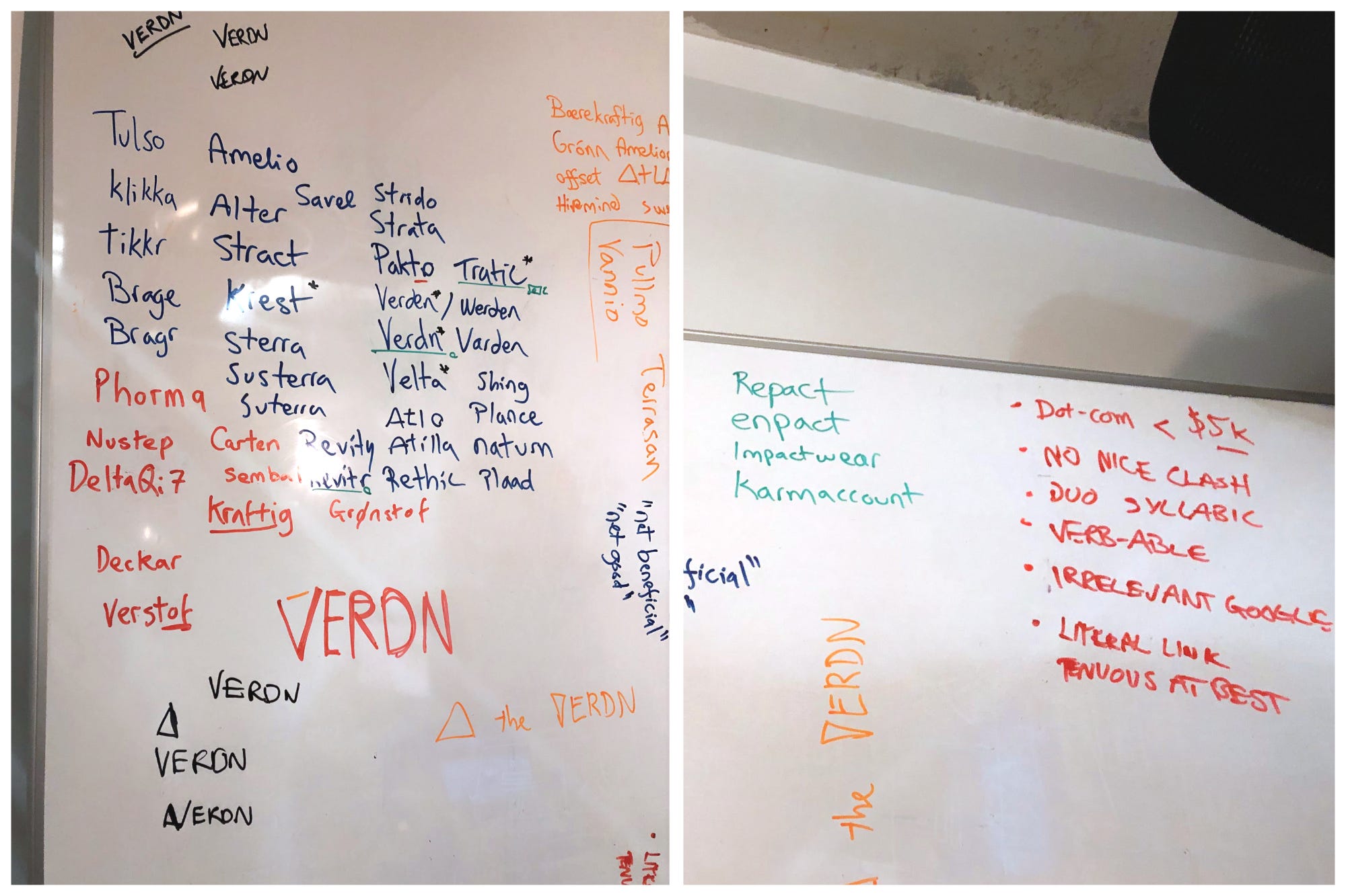
As with any good creative session, the quality was all over the map.
We had some interesting thoughts (Pakt, Enpact, Ecocred, Karmaccount); We had references to places we used to live (Strata), nicknames of family friends (Atilla) and – unbeknownst to us – a candidate name for Elon Musk’s future kid (DeltaQi7); We had parts of words (Amelio: from ‘ameliorate’ – to make something bad, better), and inelegantly smashed together parts of more blatantly thematic words (SusTerra). And, lest we forget, we had some downright awful ones (Plaad, Plance, Shing. I think those were Rory’s).
Mixed in with all of it, we had Verdn.
I had jotted Verdn down during a brainwave to look for inspiration from Norwegian. The same brainwave that made me write down Brage, Grønn, and others. Verdn, spelled “Verden”, translates to “World”.
Rory took a liking to it first. It didn’t exactly roll off the tongue, and Google insisted on showing us the Battle of Verdun instead, but it did hit his criteria. No one was using it. It was a five letter dot-com that we could nab for a couple of dollars. “In 2019, dude. This is huge.”
For me, meaning was most important, and I came around to it quickly. There was nice obvious symbolism, it was fittingly broad since we’d be doing software with various types of impacts, and it even carried on the theme of Atlas. I liked it starting with “V” because it made me think of a “Verified” checkmark. Also, draw a line over the “V” (like we do in our logo), and you have an inverted delta, the greek symbol for ‘change’. Rory — profusely Google-Translating throughout our brainstorm — discovered that variations of “Verd” tend to mean “green” across many languages. Furthermore, “Verdant” is an English word meaning “covered with healthy green plants or grass”. Very convenient.
The Verdn logo
A couple of weeks after settling on Verdn, I presented the concept to an acquaintance over coffee. He asked about the name and I explained it, adding on that “maybe one day it’ll be one of those common brand names without much inherent meaning. Like Nike”. He replied: “Oh, well Nike is the Greek Goddess of victory.”
Bested at my own game, until next time.